

༺Ƹ̴Ӂ̴Ʒ༻
![]()


![]()

![]()
![]()
![]()


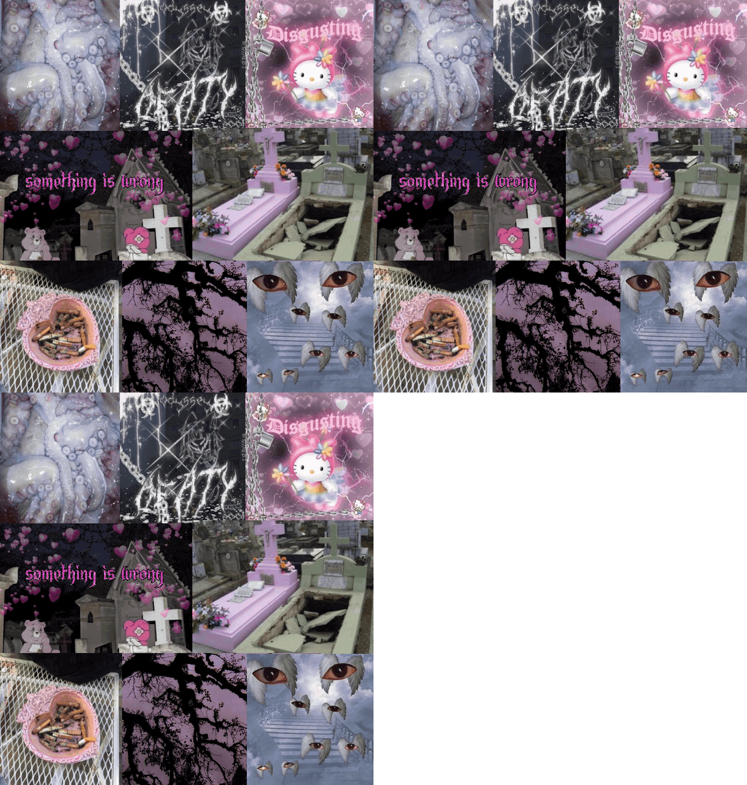



mainly bordem, i sit at home on my laptop a lot so i might as well do something somwhat productive. Likewise, i enjoy old web aesthetics and sites that allow personalization. i use this to practice html and css a bit but i think ill always enjoy tacky, simple 90s/2000s websites the most, so i dont think ill ever have a modern looking site. not only that, but i lack the skillzzz to actually create something better than mediocre. :p
body {
background-image: url("https://i.pinimg.com/564x/f5/a0/7d/f5a07d8f3a2422fca012894d678cce10.jpg");
background-color: #cccccc;
}
body {
color: plum;
font-size: 20px;
}
.grid-container {
display: grid;
grid-template-columns: auto auto auto auto;
grid-gap: 10px;
background-color: #DC143C;
padding: 10px;
}
.Hide Orange Bars
td.text table {width:100%;}
.friendsComments td table, .friendsComments td.text table, .friendSpace table, .blurbs, .blurbs td.text {background-image:url("https://i.pinimg.com/564x/5f/5d/d5/5f5dd58a2216ae60957e1bebb5193b56.jpg");}
}
body {
background: #000;
height: -webkit-fit-content;
height: -moz-fit-content;
height: fit-content;
}
h4 {
color: #9370DB;
margin: 0;
}
* {
color: #FFC0CB;
}
button, input[type=submit] {
padding: 5px;
background: #101010;
color: #aaa;
border: 1px solid #4B0082 ;
border-radius: 3px;
margin-top: 10px;
}
a, a h3, .boxInfo a div, .fwiendFace b {
color: #D8BFD8;
}
.box > :not(#form) {
padding: 7px;
}
#form > {
padding: 7px;
}
.url.box a {
color: #aaa !important;
}
.rightHead, .boxHead {
background-image: url("https://i.pinimg.com/564x/13/ab/67/13ab6763400a32fee82ae123e852c85f.jpg");
padding: 8px;
border-bottom: 1px solid #1b1b1b;
}
.rightHead b, .rightHead span, .boxHead b, .box.url b {
color: #FFC0CB;
}
#avatar {
border: 2px solid #000 !important;
}
#hSub {
top: 35px !important;
}
#header, #hSub {
background: #9400D3;
padding: 6px !important;
background: #1b1b1b !important;
border-bottom: 1px solid #242424 !important;
position: absolute !important;
}
div#hSub a:first-child {
border-bottom: 2px solid #D8BFD8;
padding-bottom: 7px;
}
#name {
color: #9370DB;
}
/* Comments */
.tableLeft {
background-image: url("https://i.pinimg.com/564x/13/ab/67/13ab6763400a32fee82ae123e852c85f.jpg");
width: 20% !important;
}
.tableRight {
background-image: url("https://i.pinimg.com/564x/31/84/64/3184647d75cc25957f4a929872492840.jpg");
}
.tableLeft img {
max-width: 100px;
max-height: 100px;
}
.date {
color: #D8BFD8;
}
.tableLeft a div b {
color: #D8BFD8;
float: left;
margin-bottom: 7px !important;
}
.module {
cursor: url(\'http://cur.cursors-4u.net/anime/images9/ani869.gif\'), auto;
}
Hi everyone!
I'm back with another profile layout tutorial! This one will be short, but I really want to tell you this because I was trying to figure it out since I joined and the friendproject support wasn't much help.
Now I want to show you how you can change the Online now icon on your profile, the one that blinks green when you are logged in. You can find custom code for them on sites like glitter-graphics.com or pimp-my-profile.com. The layout codes on those sites were made for myspace, and most of it works perfectly fine on friendproject too. However, the Online Now icons are a bit different. The code you get won't work if you just paste it into your profile editor, but I will show you what you need to to, it's really easy once you know it! Grab yourself an icon code from one of the sites above (or another one, there are many), and paste the code into your style section. It should look similar to this:
Online Now Icons
The only thing we really need is the background-image url, the line I marked in color for you. Copy it and save it somewhere in an open text editor, you'll need it later. You can delete the entire rest, we'll rewrite it ourselves entirely.
In the first step we need to hide the original online now icon so it doesn't show up anymore. For this, we will call the CSS selector .msOnlineNow img in your style section. It selects the image inside the section which is bound to the CSS class .msOnlineNow (you don't need to understand this if it's too confusing, just to explain things to people who are interested in it ^^). We will simply set the visibility of it to hidden. Like this:
.msOnlineNow img {
visibility: hidden;
}
If you visit your profile now: No Online now icon! Now we will set the one you choose! We will call the .msOnlineNow class again, but this time without the image. I won't explain all of the CSS here, but what we basically do it to set the image you choose at the background image of the section, set it so it only shows once and increase the height so it shows properly. If you're interested in what the code does exactly, you can always google the keywords, look up W3schools and play around with it yourself. This is what you need to write:
.msOnlineNow {
background-repeat: no-repeat;
background-image: url('paste your chosen url in here!');
background-repeat: no-repeat;
z-index: 2;
height:20px;
display: inline-block;
}
With this you should already be done! If you're facing any issues with it, please don't hesitate to comment or message me, I'll do my best to help you! You can also read my other HTML/CSS/Profile layout tutorials if you want ^^
